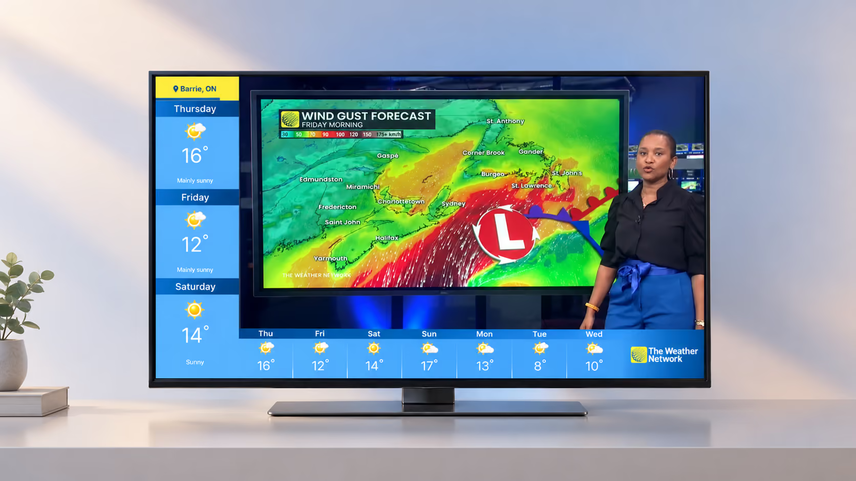
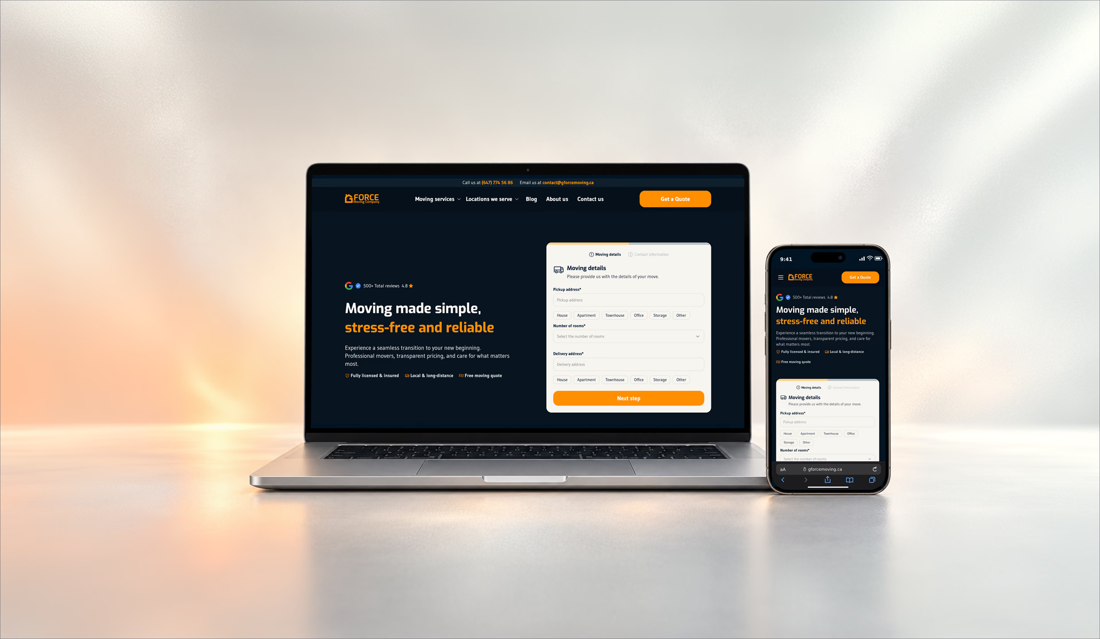
Rebuilding The Weather Network TV app to earn from ads and make weather easier to reach
I redesigned a weather TV app that launched in 2015 and did not bring in revenue, so viewers could reach their weather and manage their locations faster, and the business could run ads.
The app is also available on Roku Store, Samsung, LG webOS
Product Designer. I owned the design process end to end, from research to developer handoff, QA and launch.
The Weather Network (Pelmorex)
TV apps on 11 platforms: Android TV, Google TV, LG, Roku, Amazon Fire TV, Samsung, Sony, Xumo, Rogers Ignite TV, Videotron Helix and Xfinity
7 countries, localized by country, province and language
October 2023 to June 2025
Figma, ProtoPie, Relume, Adobe After Effects, Photoshop, Google Analytics
A product manager, four engineers, a business analyst, a product marketing manager, a web product manager, and the directors of reporting and insights and of engineering
Research, interaction, UX/UI design – all TV app pages, video player, localized splash screens, onboarding experience, Roku assets, developer handoff specs, help pages and Google Analytics tracking requirements
Key results
The data was taken from Google Analytics and compared before the app was redesigned and after 1 month it was launched.
+23% engaged users
Google Play and Roku: more users spent more than 5 minutes in the app.
3.2 rating
The Google Play rating raised from 1.9 to 3.2 after the new app launch.
Increased user satisfaction
Reflected in positive Google Play reviews and customer support feedback.
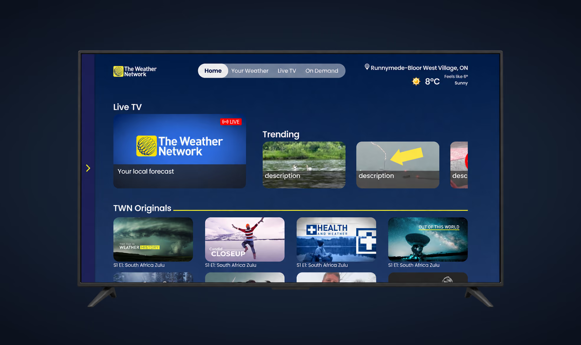
Old TV app - Home page
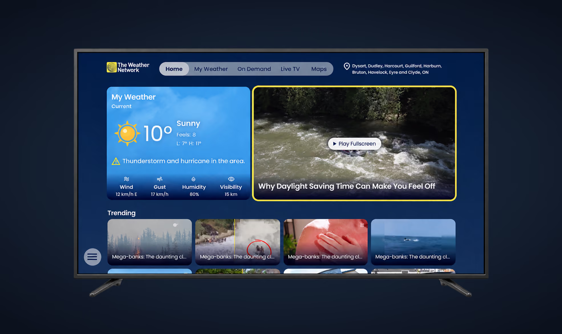
New TV app - Home page
Overview
The Weather Network’s TV app launched in 2015 and did not bring in revenue. I was hired to rebuild it so it could grow its audience and earn from ads. I owned the design from research through developer handoff and worked with product, engineering, analytics and marketing partners.
The rebuilt app runs on 11 TV platforms and is localized by country, city and language. Viewers see their weather on the main pages and manage locations in one flow. Ads play before fullscreen video, and splash screens can carry a sponsor.
A 2015 TV app that did not earn, and viewers who could not find their weather
Who it served and what the business needed
I started from three sources: Google Analytics data, reviews on app stores and social media, and user testing of the existing app, including focus groups. The participants were 10 TWN employees from different departments, men and women, aged 30 to 45 and 46 to 59. The testing took place around January 2024. An A/B test compared layouts on three screens.
What the evidence showed
“Home page looks odd. This is a weather app but I don't see the weather at all!!!”
“I like the content but I need to scroll again and again to find something I like.”
“I am looking for a storm notification but I don’t know where to look for it! The weather page seems a logical place for it but it isn’t there”
Home page
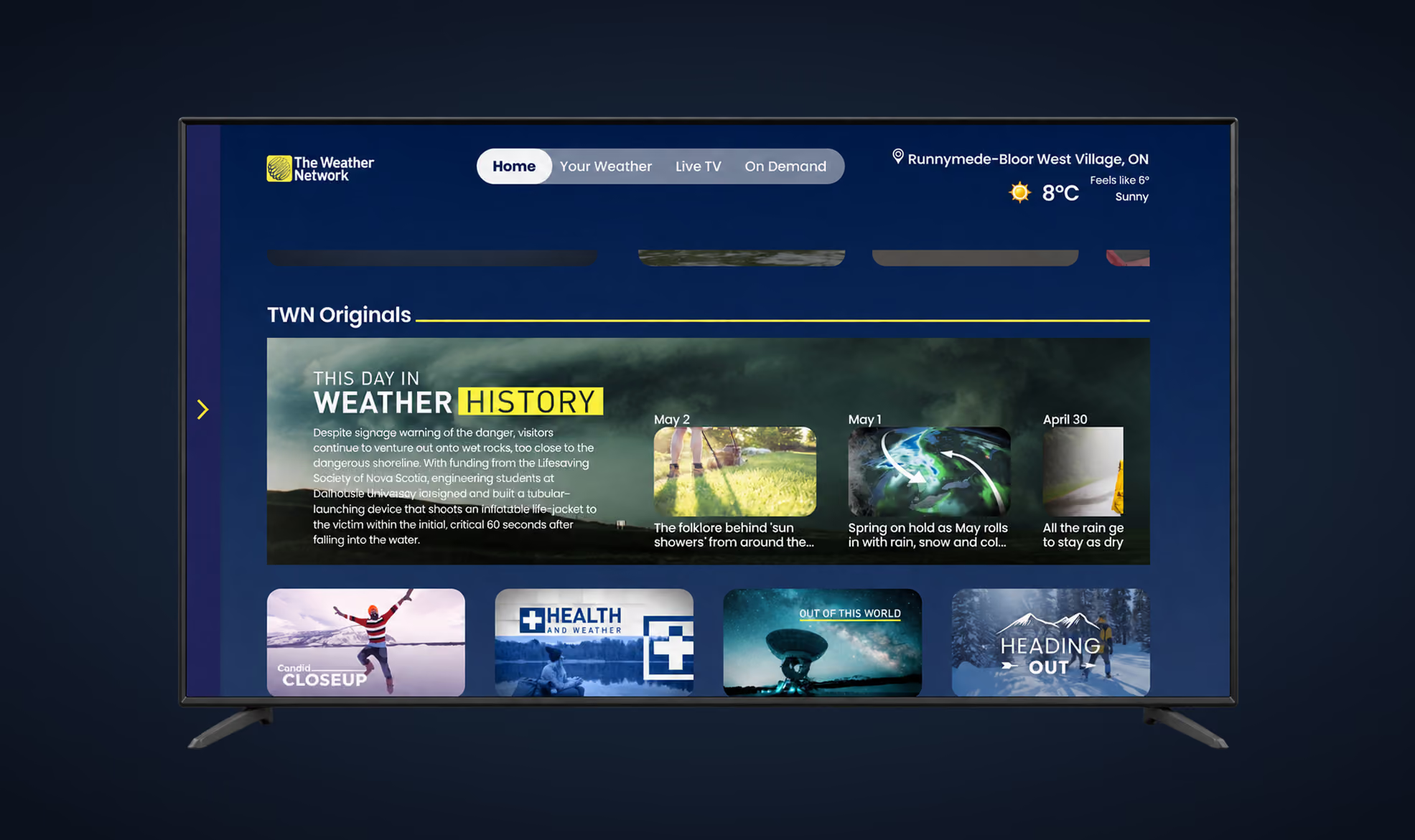
The old Home page had two rows built around TV shows: TWN Originals and Categories. Viewers could expand a show’s thumbnail and browse its episode list right on Home. At first it looked like a good shortcut. The moderated interview showed the opposite: the expanded container was too narrow to hold what a viewer needs to choose an episode, so they saw a list of titles with little else to go on.
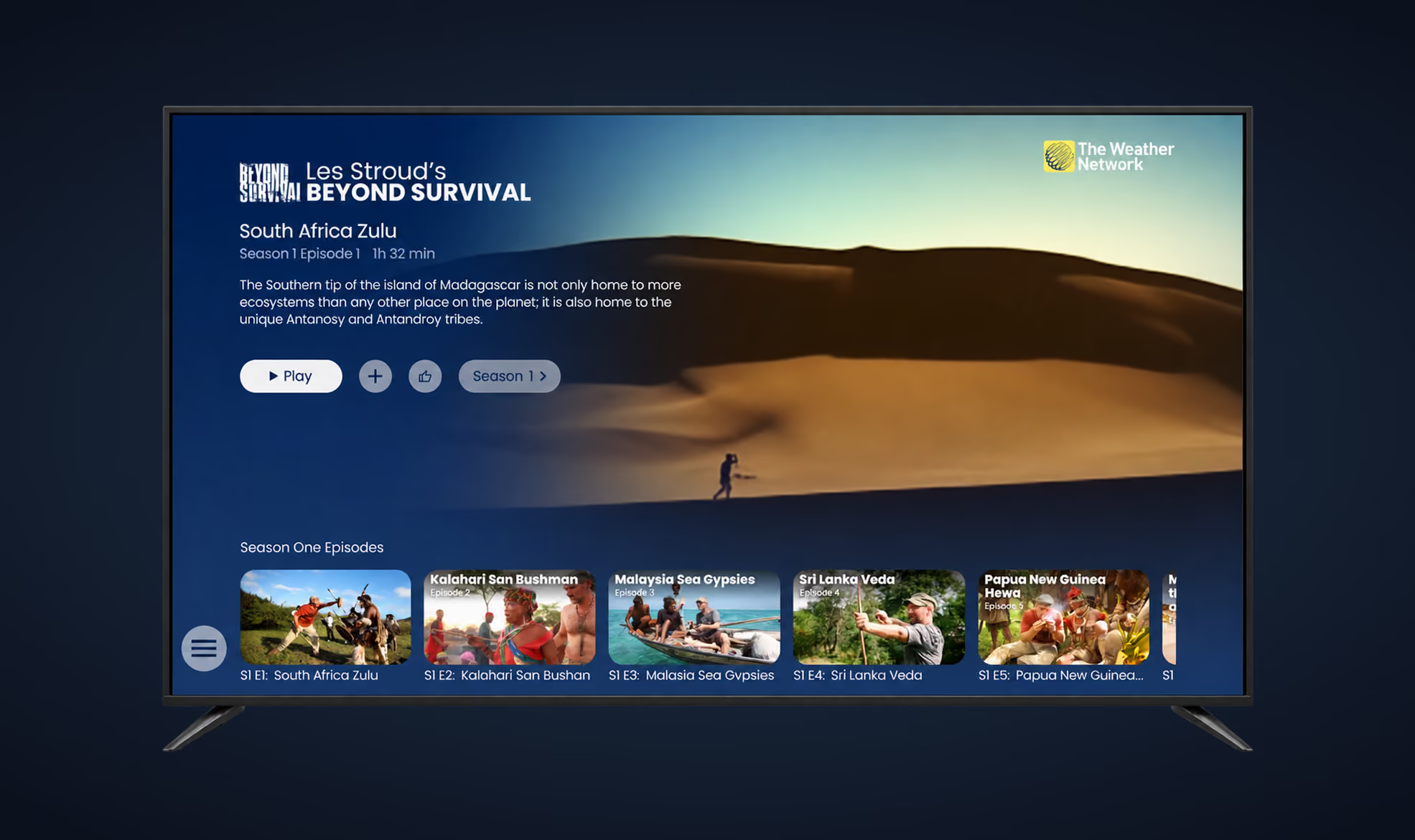
Original TV shows are one of the app’s main revenue engines, so a weak browsing experience cost more than convenience. I moved shows off Home into a dedicated TV Show page built around a video preview. The page has room for the show’s logo, episode name, season and episode number, duration and description, and focusing on an episode plays its preview. Home was left with one job: the forecast first, with Trending below it.
Old TV app - TV show details experience
New TV app - TV show details experience
Weather page
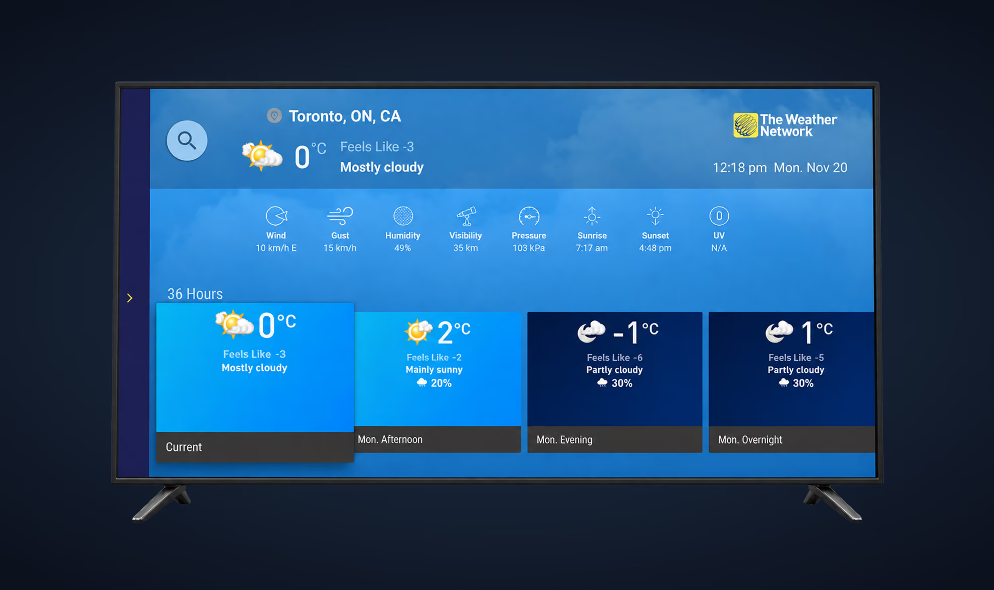
After Home, the Weather page was the most visited page in the app. The old version was built around the 36-hour forecast. Wind, gust, humidity and the other details sat in a thin row of small icons and were barely visible. The background was a static sky that never matched the weather outside, unlike our mobile app. And for one of the busiest pages in the app, it earned nothing: it had no video and no ad placement.
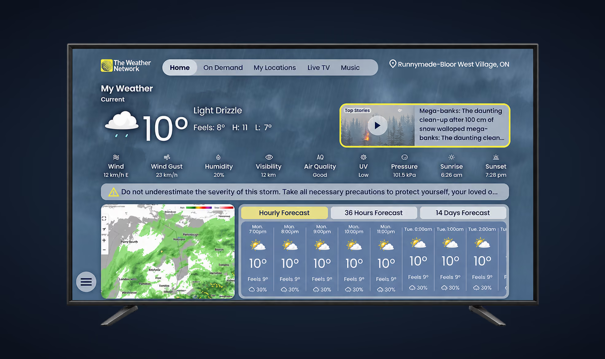
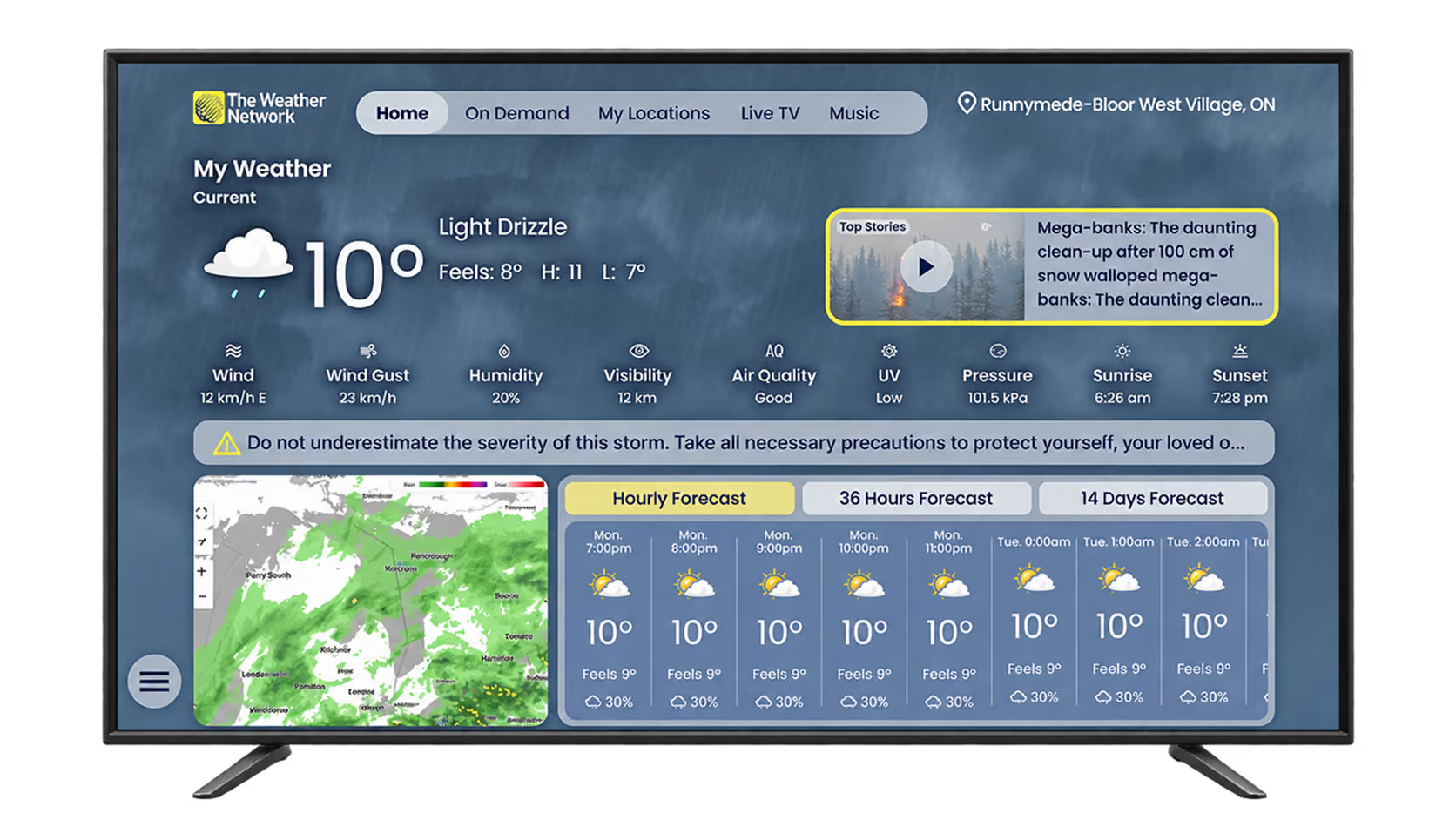
The new page leads with current conditions, with the details row larger and easier to read underneath. The background changes with the current weather. The forecast sits in three tabs, Hourly, 36 Hours and 14 Days, next to a radar map. A Top Stories card promotes the platform’s top video, and opening it starts a video ad. That gave the page its first revenue placement.
Old TV app - Weather page
New TV app - Weather page
On Demand page
On Demand was one of the most visited pages in the app, and it had no ad or sponsored placement. Viewers also struggled to choose what to watch. The collections sat in rows below the fold, so you couldn't tell how many there were without scrolling, and most viewers didn't scroll. Each thumbnail gave a title and at most two lines of description, with no details about the show or episode. At the top, viewers took the search icon for video search, but it searched weather locations. The forecast next to it filled the header and told them nothing about what to watch.
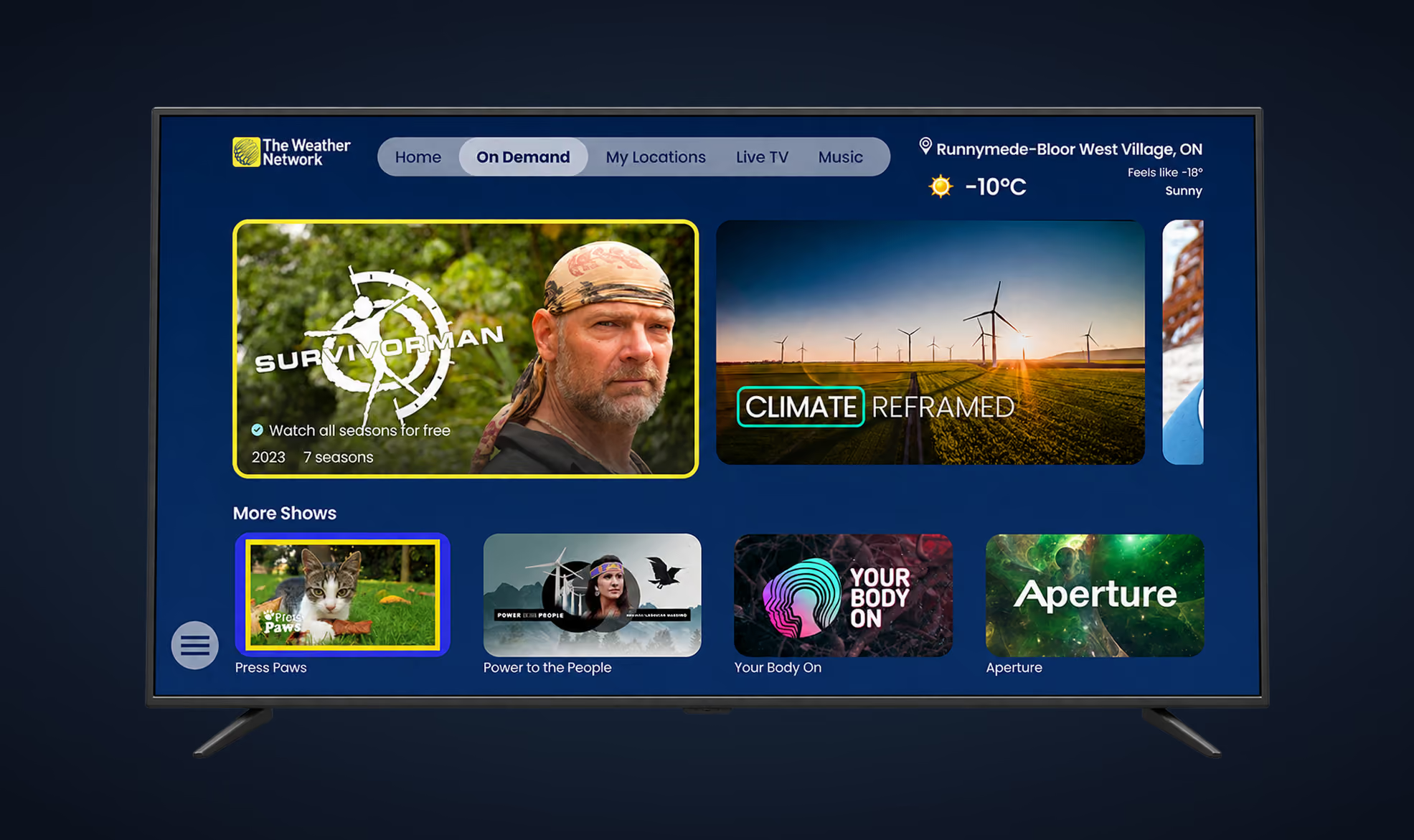
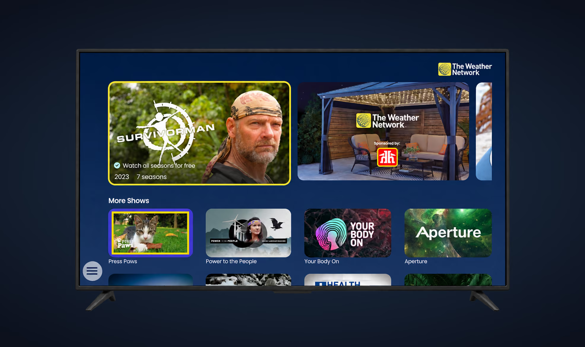
I opened the redesigned page with a hero carousel of featured shows and gave one of its five slots to sponsored content. Below it, a More Shows row lists the shows and links each one to its own details page. I removed the search icon and cut the weather down to the location and temperature in the top-right corner.
Old TV app - On Demand page
New TV app - On Demand page
Analytics showed that Weather, Home and On Demand were the most visited pages, and that video pages were among the most visited and the longest watched. The reviews and focus groups pointed to five problems: the Home page did not tell people enough, viewers wanted a mobile-style radar map experience, the forecast information did not feel useful, customizing the weather was too hard, and videos could not be sped up or rewound.
Three pain points
I grouped what I found into three pain points:
- Broken process. Viewers had to search for a location and customize their weather with no clear steps, and many couldn't finish.
- Low trust. Viewers weren't sure the forecast was for the right place, and the Weather page didn't refresh once someone stayed on it longer than five minutes.
- Low clarity. Viewers spent too long looking for alerts, videos and map settings.
The rebuilt app runs on 11 TV platforms and is localized by country, province and language. Viewers see their weather on the main pages and manage locations in one flow. Ads play before fullscreen video, and splash screens can carry a sponsor.
Constraints that shaped the work
The app had to ship on 11 platforms, each with its own remote control and navigation rules. Some set-top boxes and TVs could not handle heavy media, which later limited the splash screens. Every version had to be localized by country, city and language.
Three findings changed the brief
Video
What I found
On Demand pages were among the most visited and the longest watched, and viewers liked the original shows (e.g. Storm Hunters) and Live TV.
What I decided
Video should reach more pages in the app. More time on more pages also gives the business more places to show ads, which is my interpretation of the data.
Weather
What I found
The main reason to open the app was the weather. Reviews such as “I don’t see the weather at all” supported this.
What I decided
Weather had to be visible across the app.
Localization
What I found
Viewers wanted video and weather that matched their location, a weather background that reflected current conditions, and text and audio in their own language.
What I decided
I treated localization as part of the product from the start.
Four decisions that shaped the TV app rebuild
Fix location management first
Weather and On Demand drew more visits, but viewers still relied on the page for managing locations. App store reviews, messages to our customer support team and other user feedback pointed to these problems:
- One page handled the default location and every extra location.
- Adding or changing a location took too many confusing steps.
- Viewers couldn't set a new location as their main one.
- The users abandoned the page because of the confusing process.
That made it the first step of the app redesign.
“The app will not let me change the location and only gives the weather for a city 4 hours away!”
“When I try to add a new location so I can see the weather there, I don’t understand how to do that... It seems that I have already added it, but then I try to make it the location to check the weather on and I can’t find a button or something that would help me to finish this...”
“On SONY TV I tried to use the maps for USA but it looked broken. I don’t know how to navigate there.”
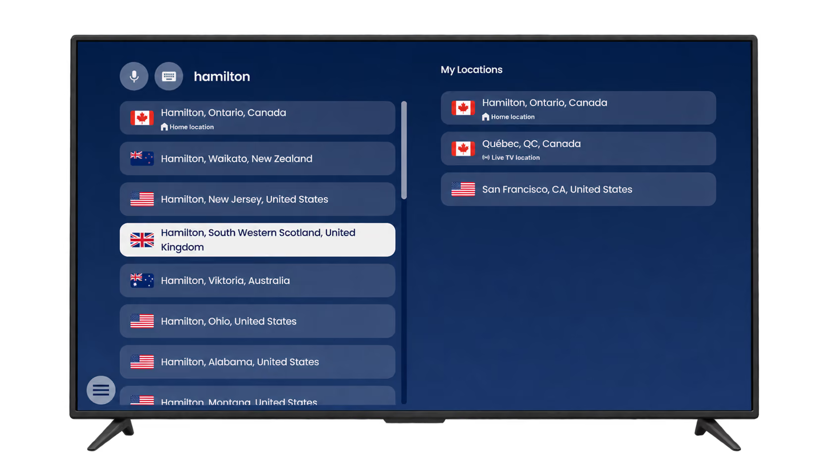
My early sketches put search and the saved-locations list on a single page. The final page has voice and keyboard search on one side and a My Locations list on the other. On first visit I highlighted the voice search icon to encourage people to use it. The list starts with one location, set from the TV’s own geolocation as the Home location. Whichever location holds the Home status always sits at the top.
I added rules to prevent dead ends. A search shows four results while the keyboard is open and seven, plus half of an eighth, once it closes. The half-visible eighth item hints at more results. The only location in the list cannot be deleted, and the delete button is greyed out with a hint that explains why. The Live TV location is set automatically and cannot be changed.
I also created and added an onboarding tutorial on the My Locations page in 6 languages.
My Locations page - Active Voice Search
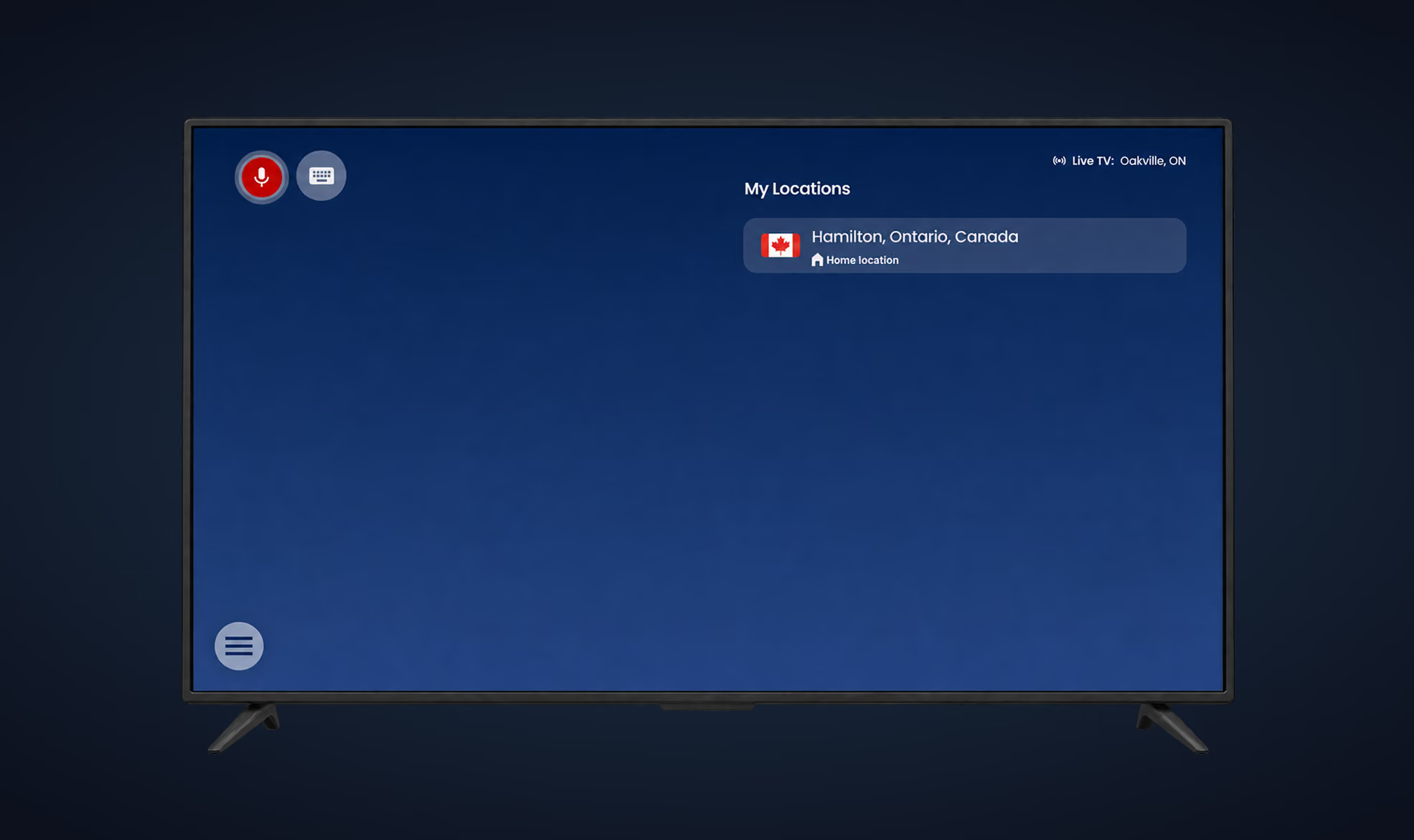
My Locations page - Search Result with the Open Keyboard
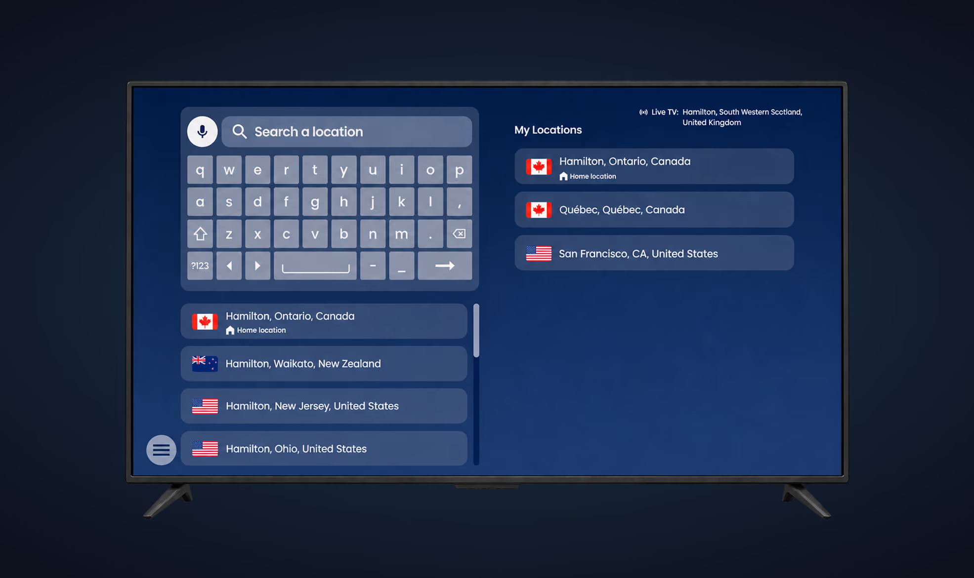
My Locations page - Full Search Result

My Locations page - Location Management

Put weather first on the Home page
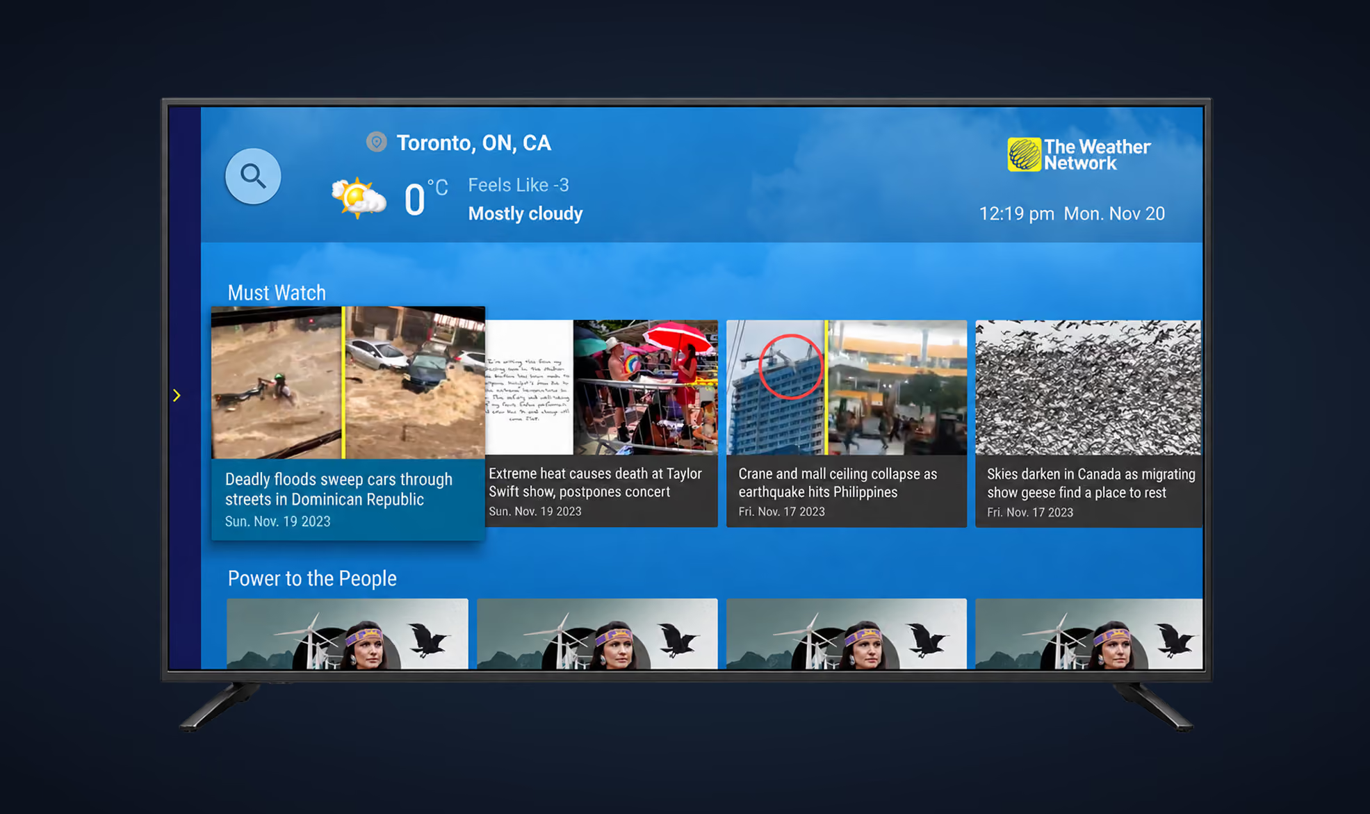
Viewers open the app to check the weather first and to watch original TWN content second. The old Home page served only the second need. It led with video, and the forecast sat in a small corner at the upper right, with few details and nothing to select.
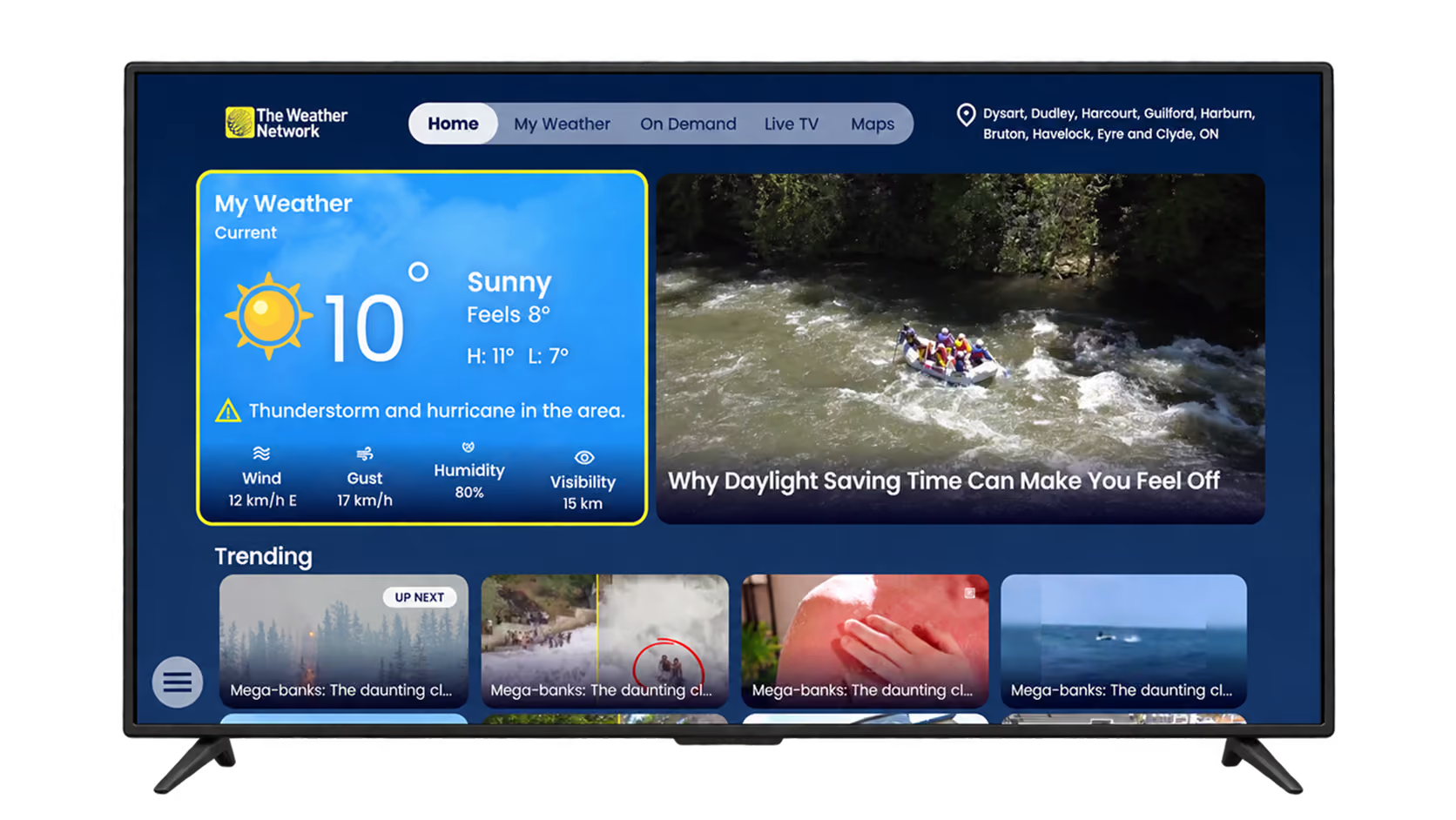
I made weather the first thing you see when the app opens. A weather card leads the page and links to My Weather. Its background matches the local weather and time of day, the same way it does in the TWN mobile app. The card draws from 13 backgrounds: clear, cloudy, fog, rain, snow and storm, each in a day and a night version, plus a default. It shows what viewers look for first: temperature and conditions, then wind, gust, humidity and visibility. When an alert is active, the card shows it too. In Google Analytics, alerts were the element viewers clicked most on the Weather page whenever one was available.
Weather on the New Home Page - Cloudy

Weather on the New Home Page - Sunny

Earn from On Demand and the new TV Show Details page
The hero carousel is the part of On Demand that viewers interact with most, so I put the sponsored slot there, as one of its five thumbnails. When a viewer opens any video from the page, a short ad plays before it starts. These two placements are how On Demand earns.
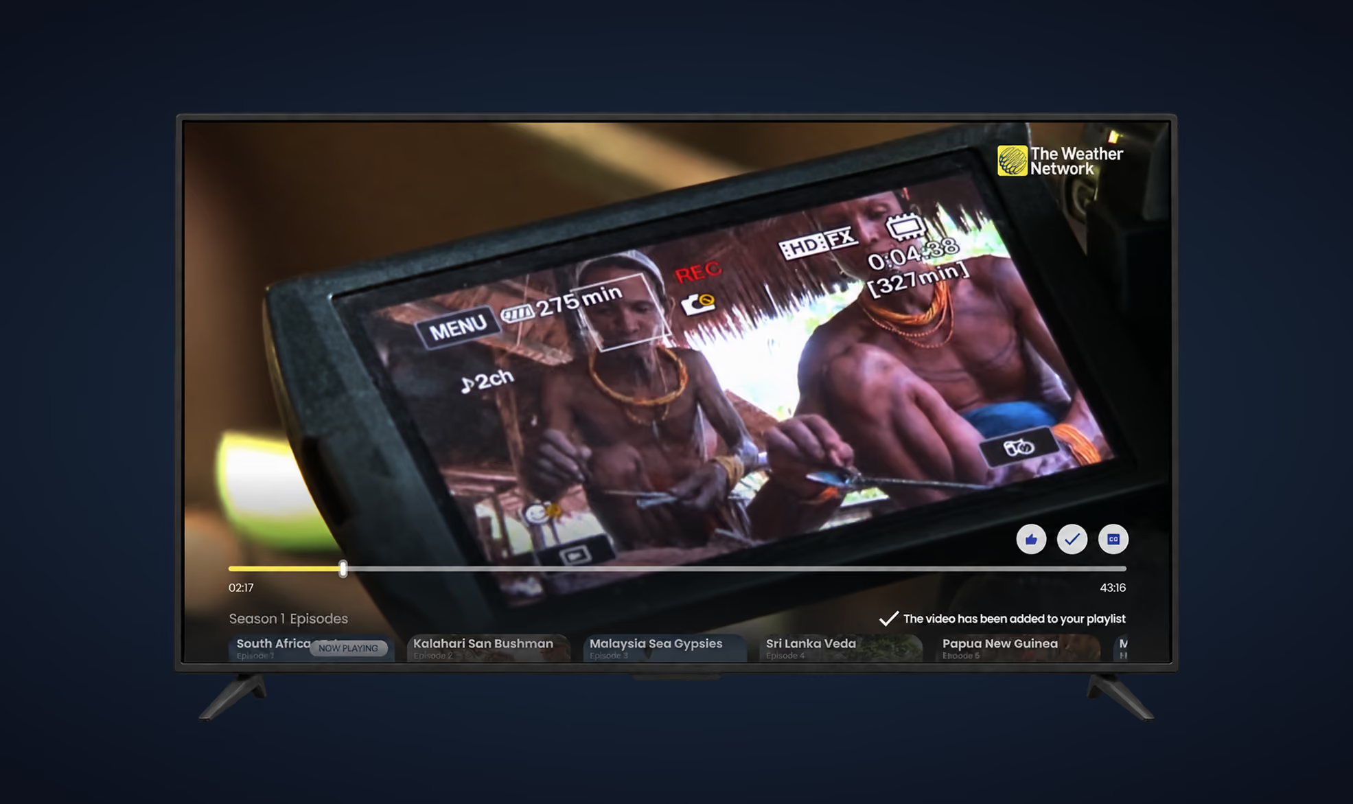
Selecting a show opens the TV Show Details page, which I built around the show itself. A muted 15-second preview of the show or episode plays as the background. Over it, the page lists the show's details, the season and episode number and the duration, with actions to save to a playlist and to like or dislike. An episode carousel along the bottom lets viewers move between episodes, and the preview changes with them.
The page earns the same way On Demand does: opening an episode plays a video ad by default before the episode starts. The cost is a mandatory ad. One focus group participant said ads every time they open a video were inconvenient.
On Demand with the Sponsored Ads
TV Show Details

- Open a video
- Short ad
- Fullscreen video
Localize the splash screen and let sponsors use it
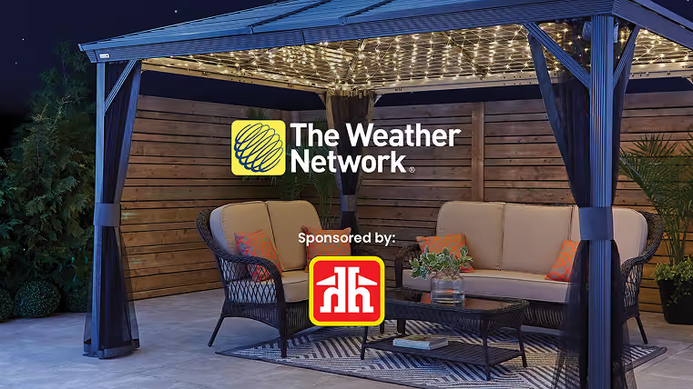
The splash screen is the first thing every viewer sees, so I used it for localization and for sponsorship. It shows one of six Pelmorex brands by country: The Weather Network for Canada and the USA, MeteoMedia for Quebec and France, WetterPlus for Germany, ElTiempo for Spain, Clima for Italy and oTempo.pt for Portugal. In Canada, the screen changes by province or territory, 13 in all, based on the Home location. A sponsored version carries the sponsor's logo and a "Sponsored by" line, with AAA contrast between logo, text and background.
I first designed the splash screens as video. Engineering found the videos too heavy for weaker set-top boxes and TVs. As an MVP decision, we shipped images instead. Images load faster, are easier to maintain across so many versions, and make sponsored backgrounds easier to produce. Video is planned for a later app update. Default splash screens show for three seconds at most, and a sponsor sets the length of its own.







How the app works
A core journey that works with a remote
The app has the following pages:
- Home
- My Weather
- On Demand
- On Demand/TV Show Details
- Live TV for subscribers
- Maps
- My Locations
- Settings
The old side menu covered the main content when open. I replaced it with a burger menu. The interaction is the same: pressing Back, or Left from the edge of the screen, opens it.
- My Weather: current weather, Top Stories, a radar map, alerts or weather highlights, and hourly, 36-hour and 14-day forecasts.
- On Demand: a hero row of up to five thumbnails, one of them for sponsored content, and a More Shows row.
- TV Show Details: a new page that opens from On Demand, with a preview that autoplays when available, a season dropdown and an episode carousel. If a show has no episodes, the carousel shows Trending videos.
Settings now lets viewers change units for temperature, time, precipitation and wind, and turn hints, captions and autoplay on or off. Maps changed from two small cards to a full-screen map.
1 · Home
2 · My Weather
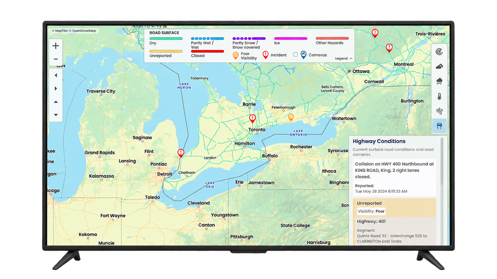
3 · Maps
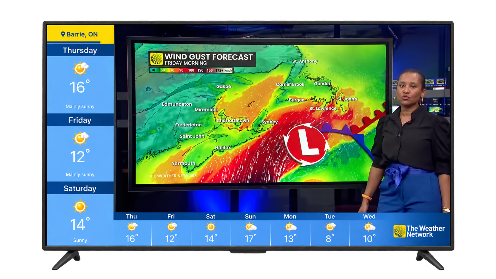
4 · Live TV (subscribers only)
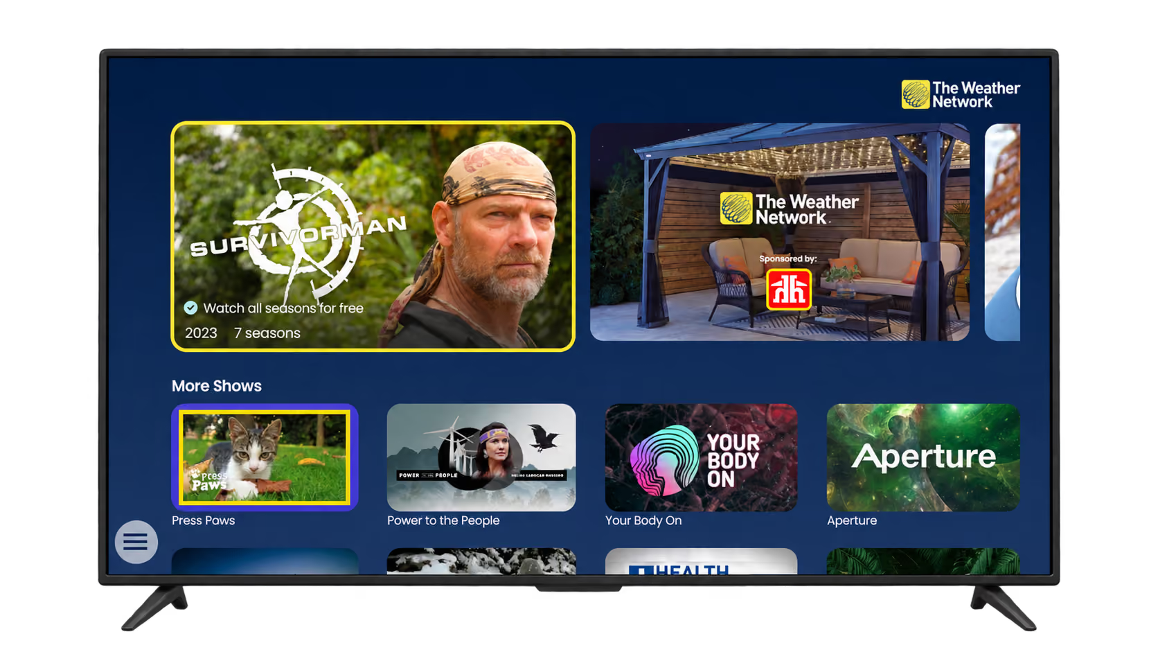
5 · On Demand
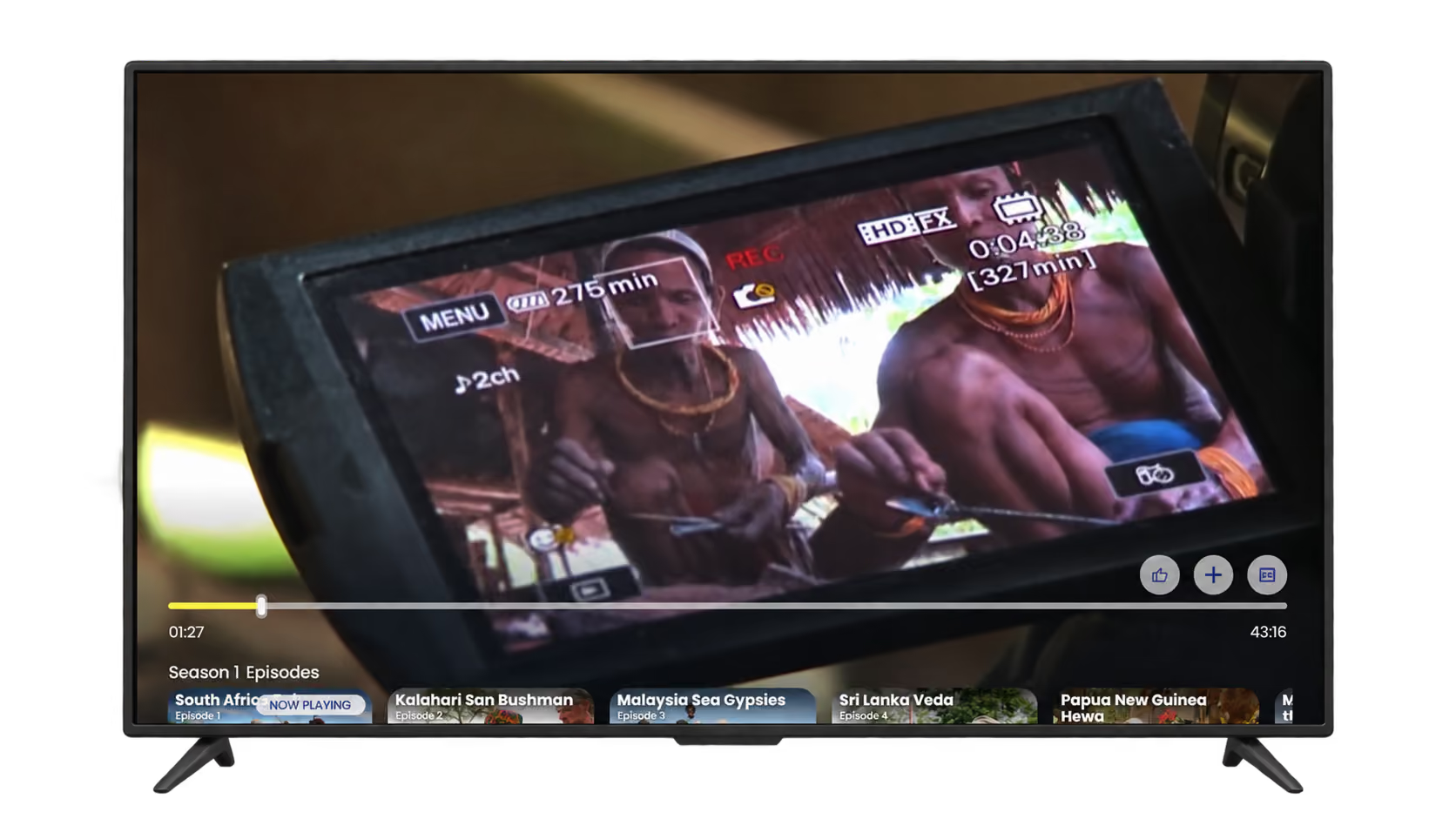
6 · Fullscreen video
7 · My Locations
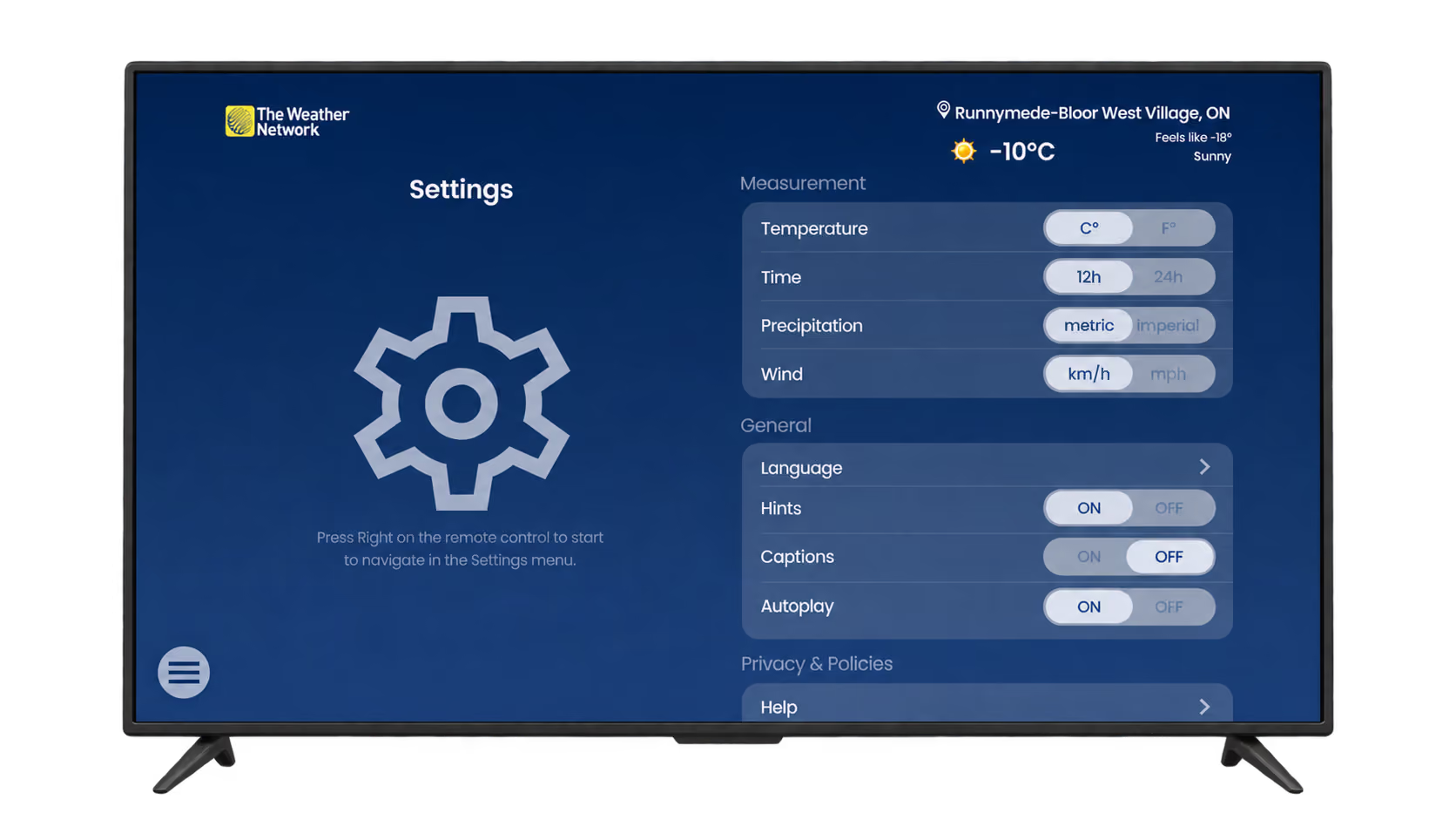
8 · Settings
Roku was built differently
I built Roku separately from the other platforms, though viewers see the same design. I created sprite images and PNG assets for the developers, and designed for Roku's own remote navigation and implementation rules. For example, on Roku, Back moves to the previously viewed screen, and from Home it opens the menu before offering an exit dialogue.
ROKU: Home Page

ROKU: My Weather Page

Help for the new users and the viewers who get stuck
On Android and Roku, I added hints, notifications and confirmations to every page, so viewers know which button to press and whether an action worked:
- Hints name the next step. On the Settings Language menu, a hint tells viewers to press Back to return to the previous menu.
- Confirmations close the loop. My Locations confirms that changes were saved, and the fullscreen player confirms that a video was added to the playlist.
- A QR code in Settings opens FAQ pages on The Weather Network and MeteoMedia websites, with video and text answers that I created.
The My Locations tutorial also plays in 6 languages.
My Locations: PopUp Hint
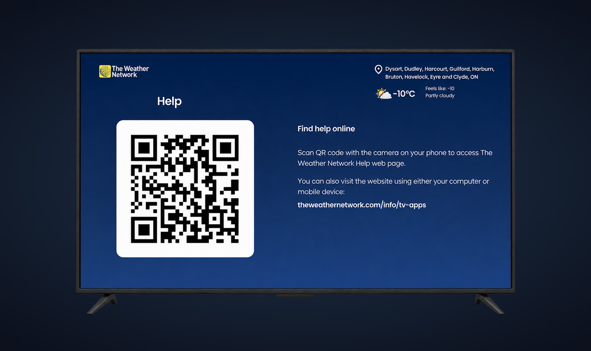
Settings/Language - PopUp Hint
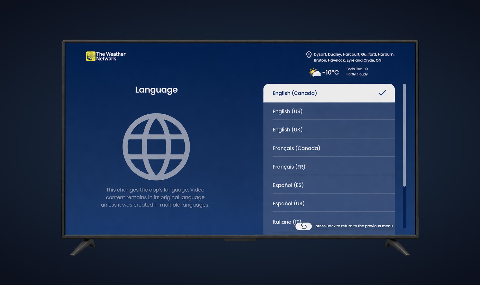
Settings: Help QR code

Fullscreen Video: PopUp Hint
Handoff
I documented each page for developers, with interaction rules, prototype videos and Google Analytics tracking requirements, in separate Figma handoffs, including one for Roku.
Testing the location experience
I tested whether people could set up and manage locations faster. The moderated sessions involved 10 TWN employees from departments unrelated to the TV app, aged 25 to 40 and 45 to 59, followed by interviews. Before the redesign, setting up locations took about 5 to 6 minutes, and some people gave up and left the app. After the redesign, it took 2 minutes or less.
Usability testing: Location setup and management
I conducted moderated usability sessions with 10 TWN employees aged 25–59 from departments outside the TV app team, followed by interviews to understand their experience setting up and managing locations.
Before the redesign, location setup took approximately 5–6 minutes, and some participants abandoned the process and left the app. Following the redesign, participants were able to complete the task in 2 minutes or less.
The findings highlighted friction in the existing experience and helped validate the redesigned location management flow.
Key outcome: Reduced location setup time from approximately 5–6 minutes to 2 minutes or less.
What shipped and what changed
My role & delivery
I owned the end-to-end design execution, including UX/UI design, specifications, and production-ready assets across multiple TV platforms. I partnered with engineering teams responsible for platform-specific implementations and collaborated with analytics and marketing stakeholders.
To accommodate device limitations, splash screens were delivered as static images rather than video, ensuring compatibility across supported platforms.
Impact & results
Following the redesign, we observed positive signals across user satisfaction and engagement:
- Google Play rating: Increased from 1.9 to 3.2.
- App adoption: Google Play users increased by 12%.
- Engagement: Engagement duration in Google Analytics increased by 23%.
- Customer feedback: Customer support began receiving positive emails and calls about location management, while app store reviews became more positive.
- Usability: Location setup time decreased from approximately 5–6 minutes to 2 minutes or less in usability testing.
These results indicate improvements in perceived quality, app engagement, and the usability of location management.
The results compare the app before and after the full redesign. Because multiple changes shipped together, the contribution of individual design decisions cannot be isolated. Although ad revenue was the primary business objective, I do not have a verified, shareable ad revenue metric to report.
2 min or less
Location setup
Down from 5–6 minutes before redesign
+23%
Engagement duration
Google Analytics, post-redesign
+12%
Google Play users
Post-redesign increase
1.9 → 3.2
Google Play rating
Improved user ratings
What I would do next
One limit is that the splash screens shipped as images, so the video version is still open. Another is that I cannot trace the results to individual decisions.