Mariia Ryzhenko
Product designer
A strategic and data-driven software designer with the front-end development skills.

SpokenLayer is a leading podcast studio that transforms written content into short-form audio for major platforms. I led the redesign of their website to better reflect their position as an industry innovator. The new experience is tailored to two core audiences—podcast creators and advertisers—and clearly communicates why partnering with SpokenLayer is a smart choice. The site now features intuitive user journeys that lead seamlessly to collaboration sign-up forms, alongside an engaging interactive media gallery showcasing curated audio playlists.
I was tasked with overhauling the outdated website to give it a bold, fresh identity that captures the essence of a modern podcast studio. A key challenge was designing for two distinct user groups—advertisers and podcasters—each with different goals and expectations. The experience needed to speak directly to both audiences while guiding them toward the same ultimate objective: starting a partnership with SpokenLayer.
I designed a dual-entry website experience with two distinct homepages—one for advertisers and one for podcasters. Using keyword targeting and referral behavior, visitors are directed to the homepage most relevant to their needs. Each pathway includes tailored messaging, visuals, and conversion-focused forms built to resonate with the specific user group. This divided into two branches approach allowed for a personalized, frictionless journey while aligning both segments toward a shared call to action: signing a collaboration agreement with the studio.
Following the redesign, the app experienced measurable gains in performance and user engagement. Below are the most impactful improvements backed by data.
Timeline: September 13, 2024 – December 15, 2024

Before signing the contract with SpokenLayer’s CEO, I conducted a heuristic evaluation of their website to identify key UX issues. The audit revealed exactly where users were dropping off before contacting the company or signing a contract. It helped the team clearly understand what wasn’t working, what they wanted to improve, and how to align the experience with their goals. As a result, the project roadmap became clear, with actionable insights that shaped the redesign.
Before signing the contract with SpokenLayer’s CEO, I conducted a heuristic evaluation of their website to identify key UX issues. The audit revealed exactly where users were dropping off before contacting the company or signing a contract. It helped the team clearly understand what wasn’t working, what they wanted to improve, and how to align the experience with their goals. As a result, the project roadmap became clear, with actionable insights that shaped the redesign.
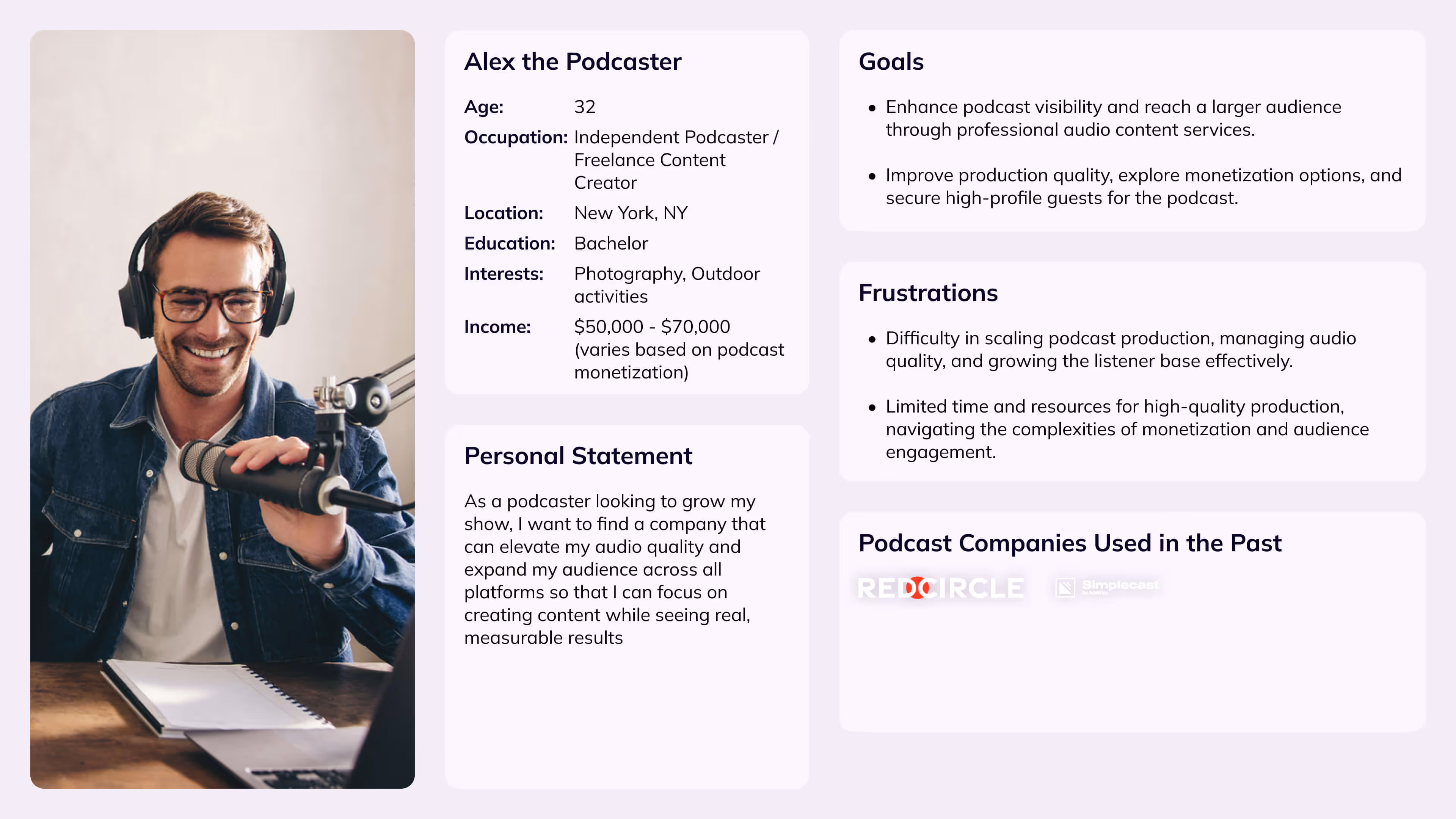
Understanding the needs and behaviors of SpokenLayer’s two core audiences—advertisers and podcasters—was critical for crafting a tailored website experience. Through stakeholder interviews, user behavior analysis, and industry research, I developed two primary personas to guide design decisions.

This is the detailed site map and content plan I developed in collaboration with the CEO of SpokenLayer, based on insights from the initial research. While this plan was approved and guided the design direction, the client later chose to restructure certain sections during development—merging content from some pages into the dedicated homepages for advertisers and podcasters. This shift reflected their evolving priorities and focus on streamlining the user journey for each audience.
After forming design hypotheses based on user research and stakeholder goals, I created interactive prototypes for both advertiser and podcaster user flows. These prototypes were tested with real users from from the SpokenLayer company. There was no budget for the testing. Therefore, it was decided to test with the spokenlayer team. to validate key assumptions, uncover usability issues, and ensure the experience aligned with user expectations.

Increase user trust by showcasing real audio samples produced by SpokenLayer, while ensuring fast load times and minimal performance impact.
If we provide lightweight, high-quality sample audio directly on the website, users will better understand the company’s value and be more inclined to sign up.
Users engage with at least one audio sample and bounce rate decreases on pages featuring samples.
72% of users played at least one audio clip, and feedback confirmed that listening helped them better understand what the company delivers.
Deliver a consistent, high-quality responsive experience across all devices, despite working with a developer unfamiliar with modern responsive design standards.
If we implement a clearly structured responsive design with defined specs for breakpoints, the website will offer a seamless experience on any screen size.
Website renders correctly across 4 key breakpoints (1920px, 1440px, 768px, 440px) without layout issues or overflow.
Several breakpoints displayed broken layouts due to developer inexperience. This experience reinforced the need to collaborate with proven, reliable developers in future freelance projects.


Both advertisers and podcasters needed to quickly find relevant information and distinct forms tailored to their goals—without confusion or unnecessary navigation.
If we create two dedicated landing experiences with clearly separated flows and customized fill-out forms, each audience will reach their goal faster and with less friction.
Users from each group should reach their respective forms in under 3 clicks.
91% of internal testers reached the correct form within 2–3 clicks, confirming that the split experience improved clarity and task completion.

